ORC Week 8: The Final Reveal
It’s One Room Challenge Reveal Day! I must admit when the last photo was taken I could feel a sense of calm and the rush of exhaustion come over me. For someone that doesn’t take naps, I took a long one that day. Thank you for following along this process with me. But before we get to the final reveal, you may need to check up on some previous weeks:
Week 1 - Announcement
Week 2 - Design Plan Revealed
Week 3 - Kitchen Details
Week 4 - Tile installed
Week 5 - Kitchen Cabinets Painting
Week 6 - Ordering Issues
Week 7 - Styling Accessories
Welcome to my Black Kitchen! The cabinets went from maple with a linen glaze to Tricorn Black by Sherwin Williams in a satin finish. And while my kitchen layout didn’t change I did some strategic things to make sure it didn’t feel like a cave. The first thing I did was have six of the upper cabinet doors routed for glass inserts. I knew this would break up all the black. Second, I decided to have the inside of the cabinets painted Chantilly Lace like in the inspiration photo I shared in week 2. Also a fresh coat of Chantilly Lace on the ceiling did a lot to brighten the room. It was important to balance the black cabinets with enough white elements, so I selected this gloss porcelain herringbone from The Tile Shop. The clean, modern and simple design feels fresh, yet timeless. To highlight the pattern, I used a whisper gray gout to pick-up the light gray veining in the quartz countertop. I love me some brass, which can be seen throughout the kitchen - and throughout the house.
KITCHEN REVEAL
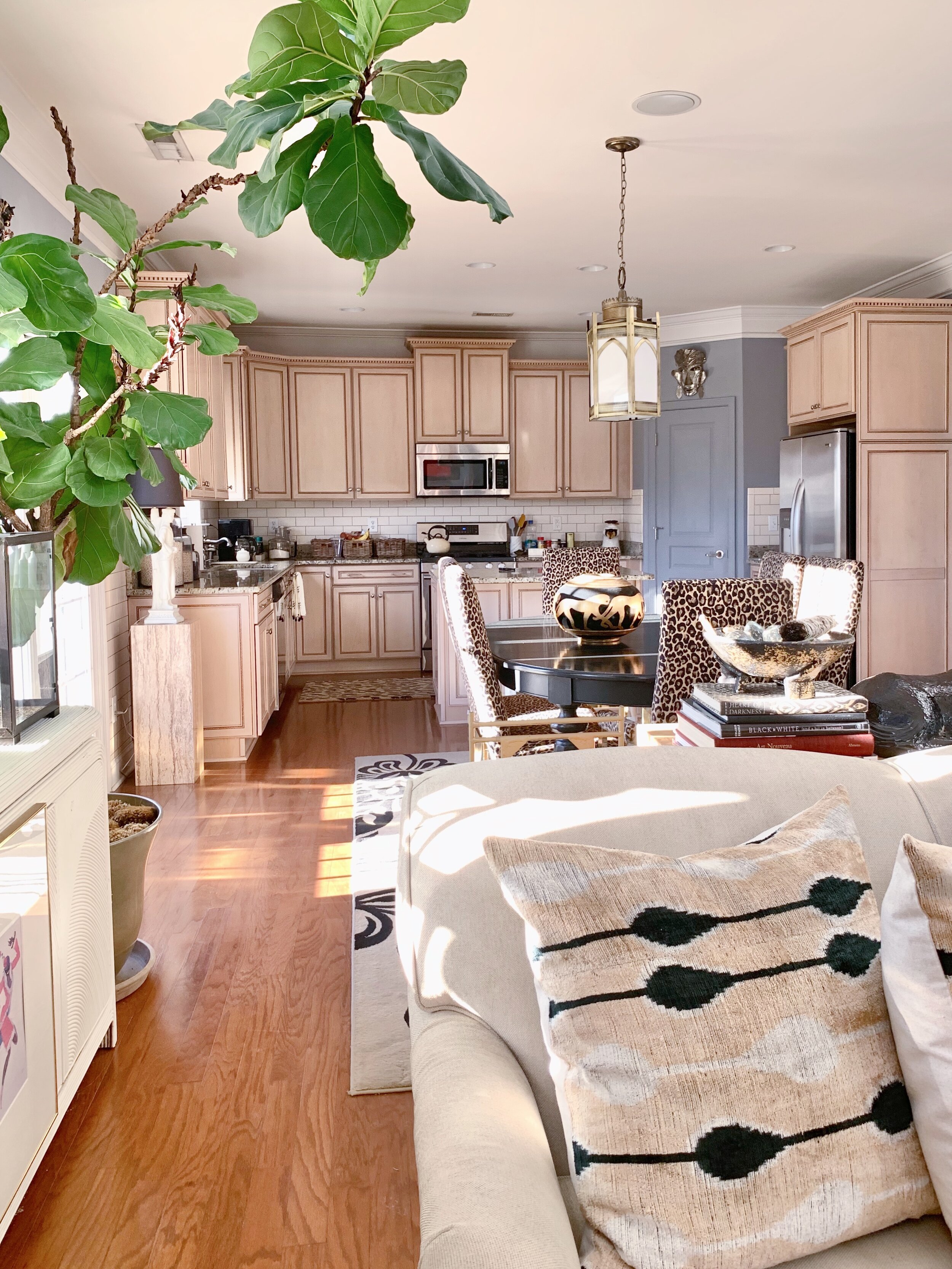
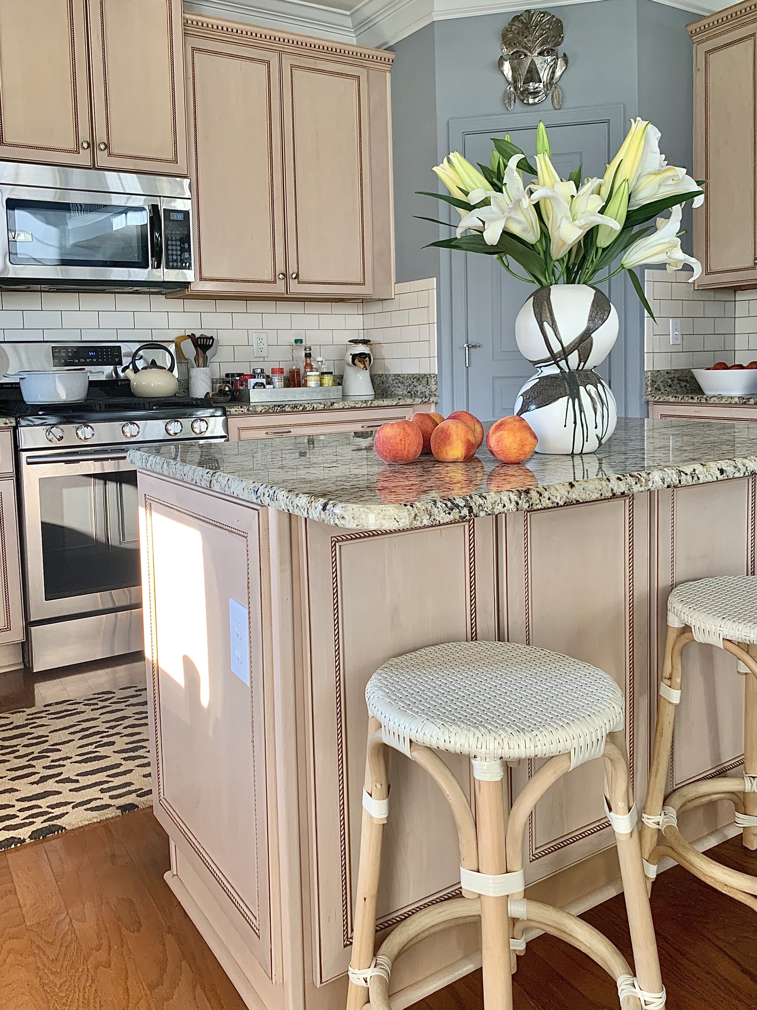
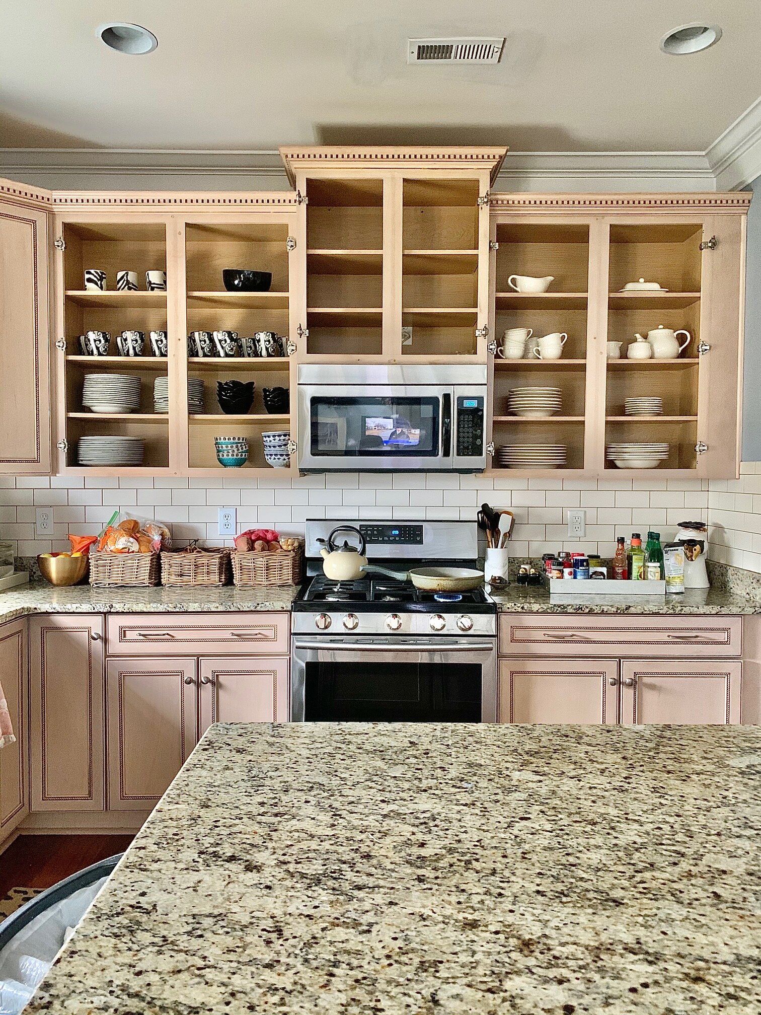
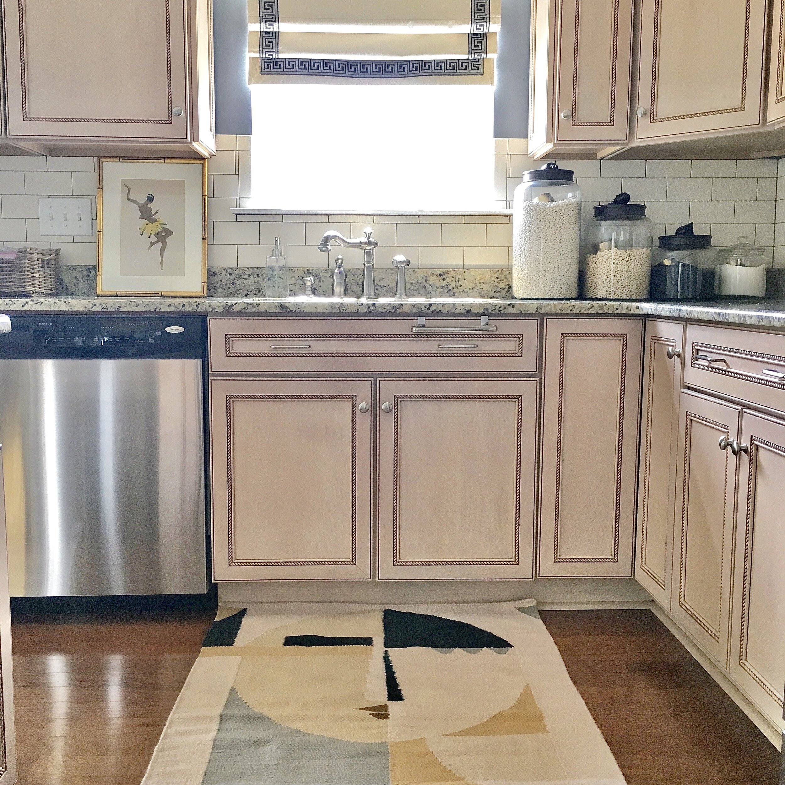
KITCHEN BEFORE:
This Eastly 50 Ink Fabric from Calico looks better than I expected on our custom Roman shade. This pattern will hide all stains and look good doing it. The graphite gray adds some dimension to the black cabinets, while also providing a bold graphic backdrop for the Broomley pendant from Hudson Valley Lighting, am I right? Small in scale but big in detail, the Broomley is a combination of ’70s streamline design with mid-century mixed mediums which speak to my vintage loving heart.
The roman shade fabric nicely picks up the same graphite/charcoal colors in the runner from Loloi’s Alice Collection by Chris Loves Julia. It feels great underfoot and has a beautiful sheen that I wasn’t expecting.
The Bridge Faucet with Angled Spout and Industrial Handle from Brizo’s Litze® Kitchen Collection is a beautiful compliment to all the other brass elements in the kitchen. It melds together innovative engineering and artistry to strike a balance that is equally at home in modern, classic or urban industrial spaces. The Brilliance® Luxe Gold® finish also compliments the brass elements going into the dining area.
Our Small Bee Bowl from Jill Rosenwald in Versailles jet black is making a big pattern impact on our countertop. I was looking for a substantial bowl with pattern to hold larger fruits like these Korean melons and boom!
Hardware is an integral part of a room’s design theme and I love the versatile design of the Brandt Knob by Emek in satin brass. This knob is the perfect bridge between the traditional elements of my cabinetry and the sleekness of painting them black. I paired the Brant Knob with the clean transitional elements of the Japser Pull in satin brass to complete this look.
The details matter, so I also took this opportunity to update our switches and outlet’s with Legrand. We love the pattern switches, from the Adorne Collection. They provide a clean and modern twist on the classic up-and-down switch control. The Paddle Switch lets you turn lights on and off with ease. I think my favorite part is the screwless Wall Plates. They come in a variety of colors and while I could have done them in black, I didn’t want to draw you item to them immediately.
We continued our graphite scheme with these grey Cornelia Leather Counter Stools. They are leather and easy to clean and have a generous seat. The antique brass legs compliment all the brass elements in the kitchen and in our home. I really love the classic and clean lines, they are truly timeless.
EAT-IN KITCHEN REVEAL
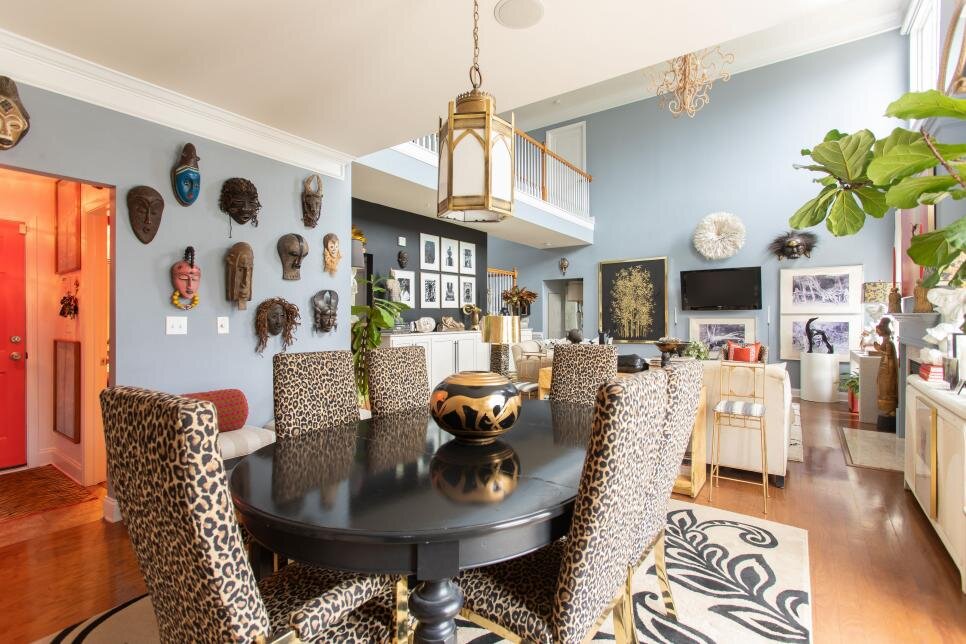
Nothing is the same in our eat-in kitchen turned dining room - New lighting, table, chairs and rug. It’s open to our kitchen and family room so it needed to flow seamlessly. Let’s get into the design, shall we!
The star of the show in the eat-in dining area is the Hexsation Pendant from Hudson Valley designed by Martyn Lawrence Bullard for Corbett Lighting. It’s modern and has an Art Deco-inspired feel and warmth which is exactly what I was looking for the dining room. It also plays nicely with the Broomley pendant over the sink in the kitchen.
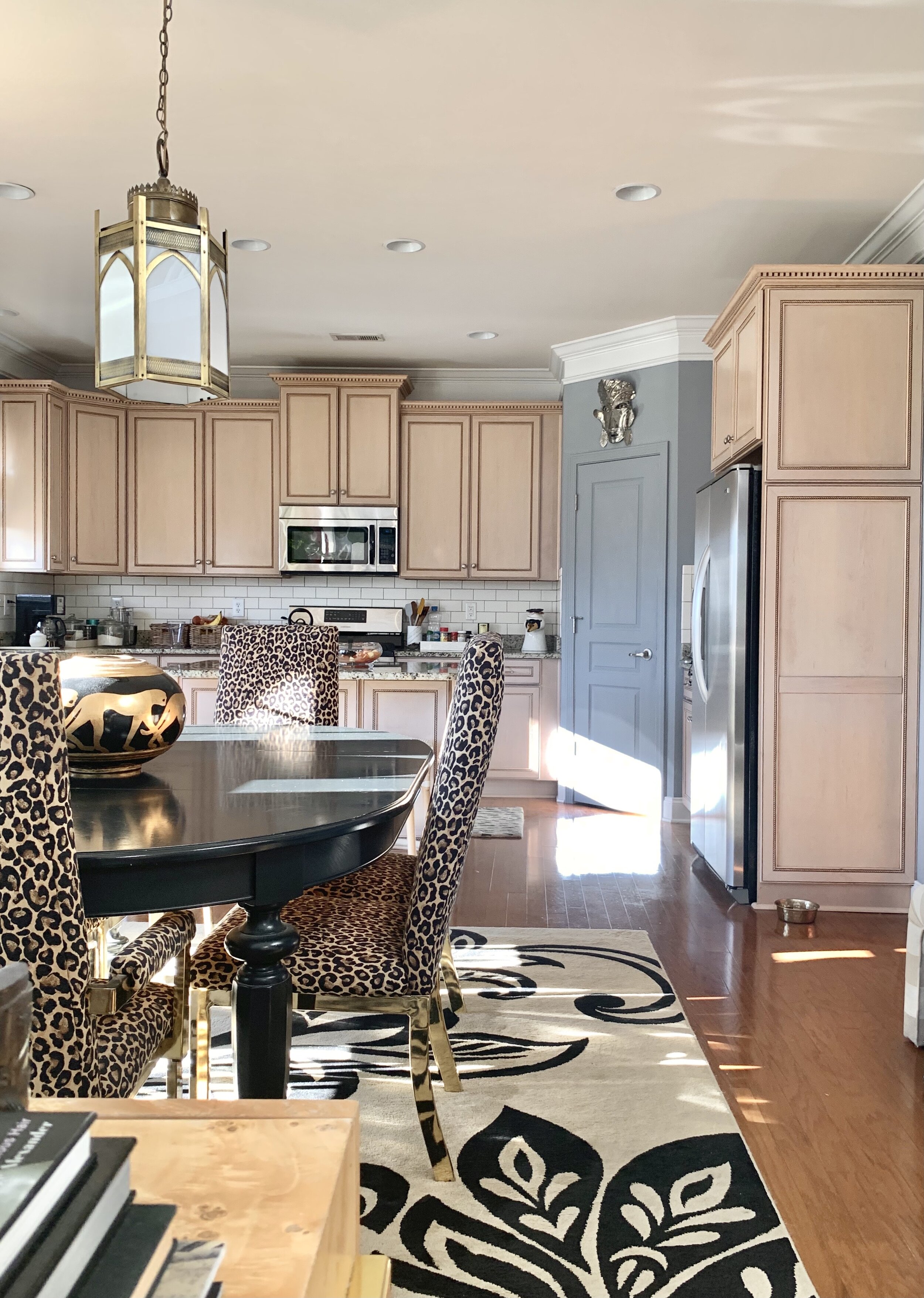
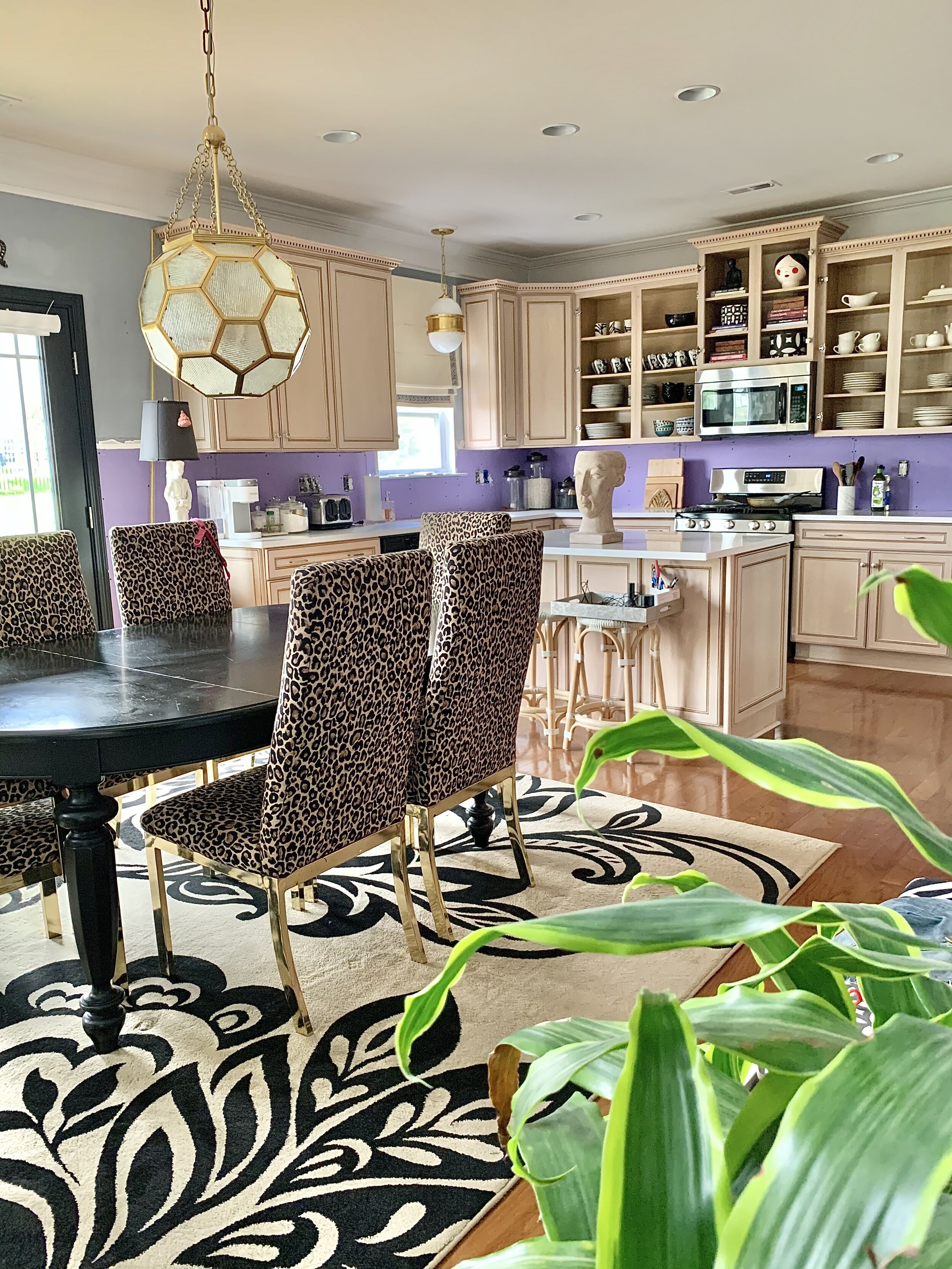
EAT-IN KITCHEN BEFORE:
I love our Spoonflower Storks on linen table cloth and napkins by Virginia O paired with the Humble Bee Honey Bee Floral Flowers placemat by Magnolia Collection. Together they make for a layered custom look. This makes the place settings more interesting without being so matchy. It may not be for the every day but we love it for parties or an anniversary dinner. Bonus - brunch with the girls just got a lot more fancy!
As I mentioned before, I wanted a lower profile chair that felt more open and the Quinn Arm Chair was the perfect compliment to the dining table. They have a generous seat and the round back coupled with high arms make them extraordinarily comfortable for long dinner conversations. Which speaking of - I can’t wait to fully break them in with my first dinner party! I have it all planned in my head. I’m been watching High on the Hog: How African American Cuisine Transformed America and my plan is to make one of the Charleston meals. I share more on that later.
It’s the details that make a design go from good to great, and I bet you didn’t notice the pantry door hardware. I changed out our nickel hardware for the Emek Select R-Bar Knurled Lever in a flat black finish. This finishing detail carries the black throughout the kitchen.
Not to be upstaged by the Hexsation Pendant, our Culinary Circle Dining Table from Caracole has a simple elegance. I fell in love with the radial-matched eucalyptus pattern and I think it’s the perfect compliment to the black cabinets. The Art Deco-inspired pedestal plays well with the Art Deco feel of the pendant.
With an open concept family, dining and kitchen, I wanted a rug for the dining room that would compliment the not only the colors in the open concept space, but also the other rugs in the room. The Glasgow Rug from Surya color-blocking details picked complimented all the geometric shapes in the kitchen. It’s soft underfoot with a blend of viscose and wool material.
I can’t wait to host friends in my new dining area, and this tablecloth and napkins from Spoonflower in Storks on linen with the Humble Bee Honey Bee Floral Flowers placemat is going to elevate my brunches! My love for mixing pattern can front and center.
FAMILY ROOM UPDATES
Since the family room is open to the dining room and kitchen, I decided to make some strategic updates like these custom drapery panels from Martha & Ash with fabric from the Teresa Roche Art collection. I selected this beautiful Twombly abstract in Blue-Gray that works beautifully against our Smoke blue walls (paint by Glidden 14 years ago). I was looking for something with a subtle pattern and a little color and they delivered on both. I went with a double width euro pleat in linen cotton blend and they add so much sophistication to the room.
The second thing I updated was the lamps shades to these Gold Foil Lamps Shades from Couture Lamps. They perfectly tie in all the brass elements in the kitchen and dining room as well as our brass coffee table. The new shades allow the finial to pop. Little touches like this make a big impact to a room.
Last but certainly not least is the art above the drapes. These limited edition canvases from Minted compliment the 1960’s oil painting over the fireplace. They are Desert Dance I and Desert Dance II by Cyrille Gulassa. An open concept room doesn’t leave much wall space so you have to get creative; and these framed canvases were the perfect size and punch of color the room needed.
I had these waterfall benches reupholstered in Calico Bogolan - Crypton Home - Obsidian. This fabric helps tie in all the patterns together and it is Crypton! I love the graphic abstract pattern and they tie in the black and cream pillows on our sofa. We use these benches daily to take off shoes, place bags and everything else so knowing they will now be easy to clean is what we needed.
A special thank you to Linda Weinstein, creator of the One Room Challenge for her support and encouragement throughout the obstacles. Thank you to my sponsors for working miracles to get my products to me in one piece and on time!!! If you’ve ordered anything within the last year you when I say “miracles” I’m not exaggerating: Ballard Designs, Brizo, Calico, Caracole, Chairish, Couture lamps, Emtek, Hudson Valley Lighting, Jill Rosenwald, Legrand, Loloi, Martha & Ash, MINTED, Spoonflower, Surya, Teresa Roche Art, The Tile Shop and Universal Furniture.
Don’t forget to check out the Final Reveal of the other 19 Featured ORC Designers below!
At Home With Ashley | Banyan Bridges | Bari J. Ackerman | Brit Arnesen
Brownstone Boys| Cass Makes Home | Dominique Gebru | Gray Space Interiors| Haneen's Haven
Home Ec. | Nile Johnson Design | Pennies for a fortune | Prepford Wife | Rachel Moriarty Interiors
Sachi Lord | Susan Hill Interior Design | This Is Simplicite | Tiffany DeLangie | Victoria Lee Jones


