One Room Challenge Week 1
Well, the cat’s out of the bag with the announcement of the 20 designers and influencers for the Spring 2021 One Room Challenge! Every Wednesday, make sure to tune into my blog and Instagram account to see behind the ORC. I will be sharing my design thought process, sources and professional advice over eight weekly posts. And if I’m not too excited I will share my unboxing with you too. In case you are new to following, I’m Ariene shop owner and principal of Dressing Rooms Interiors Studio. I own a vintage boutique selling furniture, lighting, art and decor. While I’m used to juggling between the shop and design projects the ORC is a whole different animal.
After 14 years, I will be updating my kitchen - FINALLY!!!!!!!!!! When we purchased our home in 2007 I had two main requirements, first I wanted to be able to see the TV from the kitchen. I enjoy cooking and in our old apartments I was never able to be in the same room with everyone. This was before you could rewind TV shows - so I’d miss everything! Being able to see the TV from the family room was important to how we lived. This explains the current position of our TV in the family room and why it isn’t over the fireplace. The second requirement was that I wanted white kitchen cabinets. Our realtor advised me that no one in the south wanted white kitchens and I would have a hard time selling our home with them ( this was in 2007). I didn’t care what he thought, I knew what I wanted. We finally found a builder that offered white cabinets (and checked the boxes on everything we were looking for, not just cabinets) so we signed the agreement. At our design center apportionment I learned the white cabinets were FORMICA!!!! Are you kidding me? Disappointed doesn’t describe the feeling. So I selected the lightest cabinets available. My husband suggested we paint them immediately but I just couldn’t justify the expense after purchasing a new home relocating to a new city.
So here we are today, 14 years later and I’m updating the kitchen cabinets. And while my real estate agent was hella wrong about white kitchens (as we all know), now I want black kitchen cabinets - what do you think he’d say about that? It didn’t matter then and it definitely doesn’t matter now. Here is a list of the kitchen updates:
Replace Roman shade
Install pendant light over sink
New sink and faucet
Replace backsplash
Replace outlet covers
Replace countertops
New kitchen runner
New bar stools
New Stove
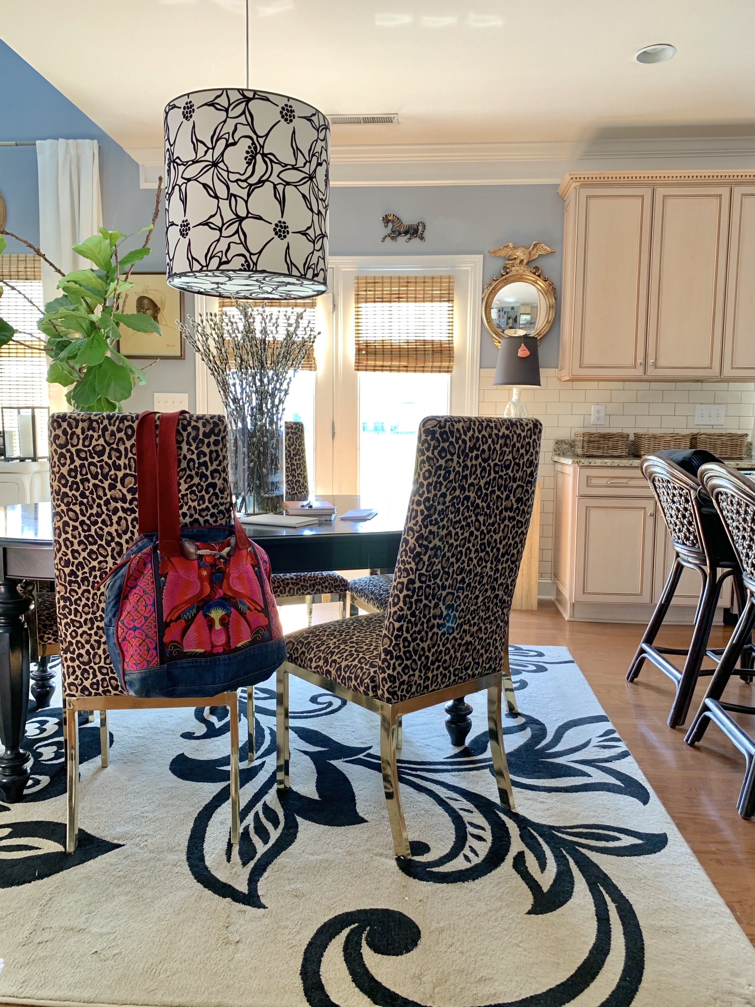
This is just the kitchen, next is the update for the dining area. We haven’t touch this area much either. The newest addition was our dining chairs about 5 years ago. I still love these vintage chairs I had recovered, I get offers to purchase them all the time. Well, now is the time! Our dining table is 14 years old and well loved. We brought it with us from Boston. It has served us well, but it’s time for an upgrade. I’m excited to have a lighter table. As far as the pendant, we need a new one period. I’ve been very picky about finding one. Something not too modern but not too traditional. For dining chairs, I want something lighter and more open. With black kitchen cabinets, I wanted to have a lighter dining space. Here is the list of items for the dining room makeover:
New dining table
New dining chairs
New pendant light
New Area rug
New art
Now let’s see what the spaces look like before we jump off the ORC bridge!
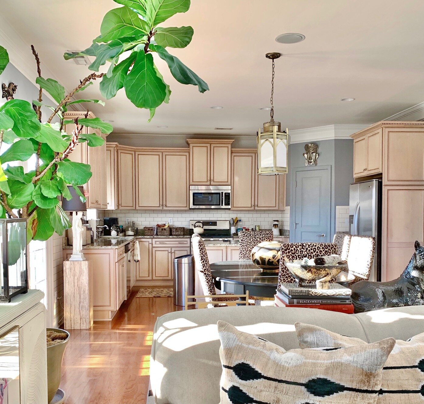
You can see here I tied the pillows in the family room to the kitchen cabinets.
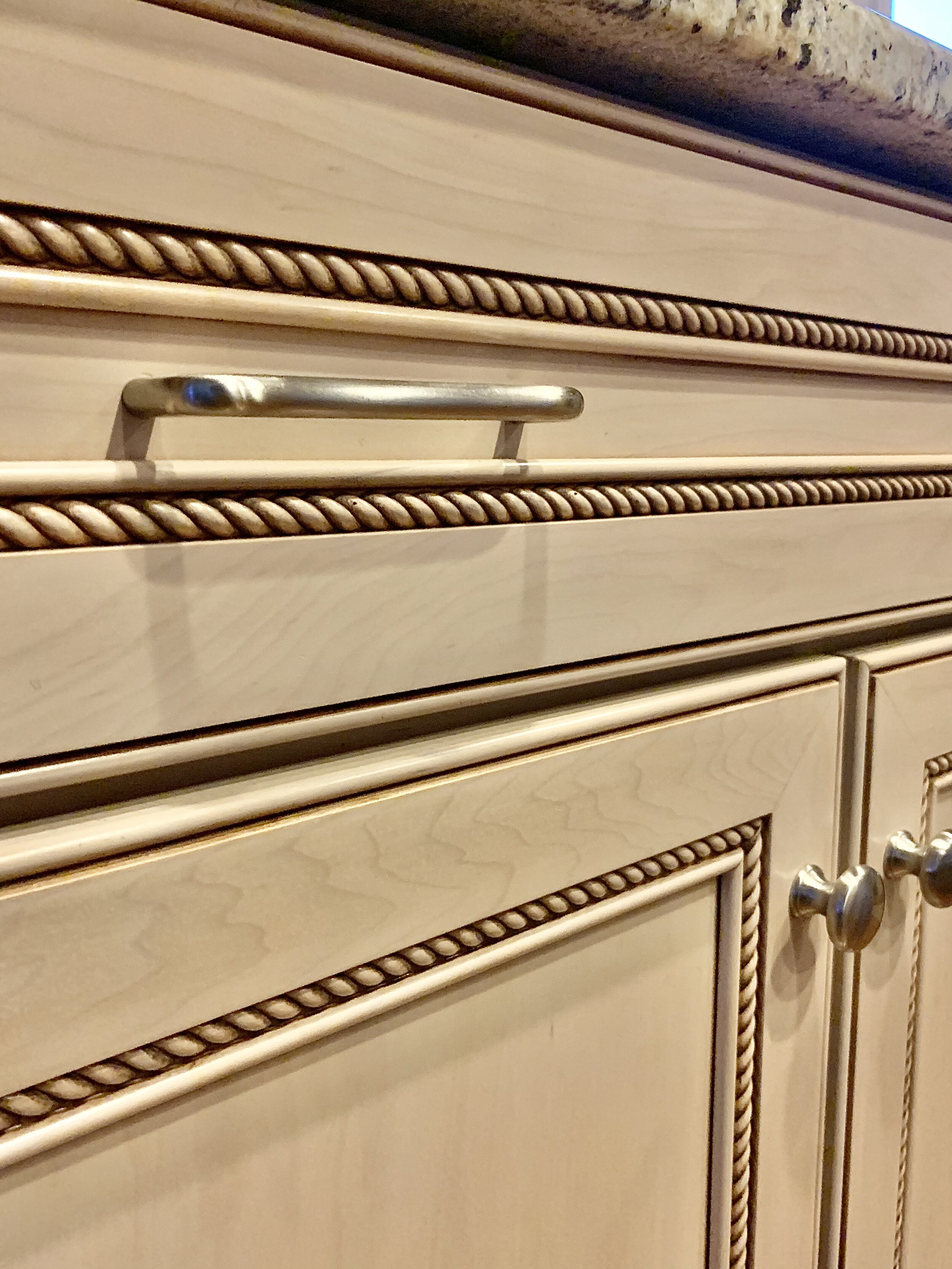
Kitchen cabinets are maple with a linen glaze. I do like the rope details and crown moldings.
Cabinets are in excellent condition. A close-up of the rope detail.
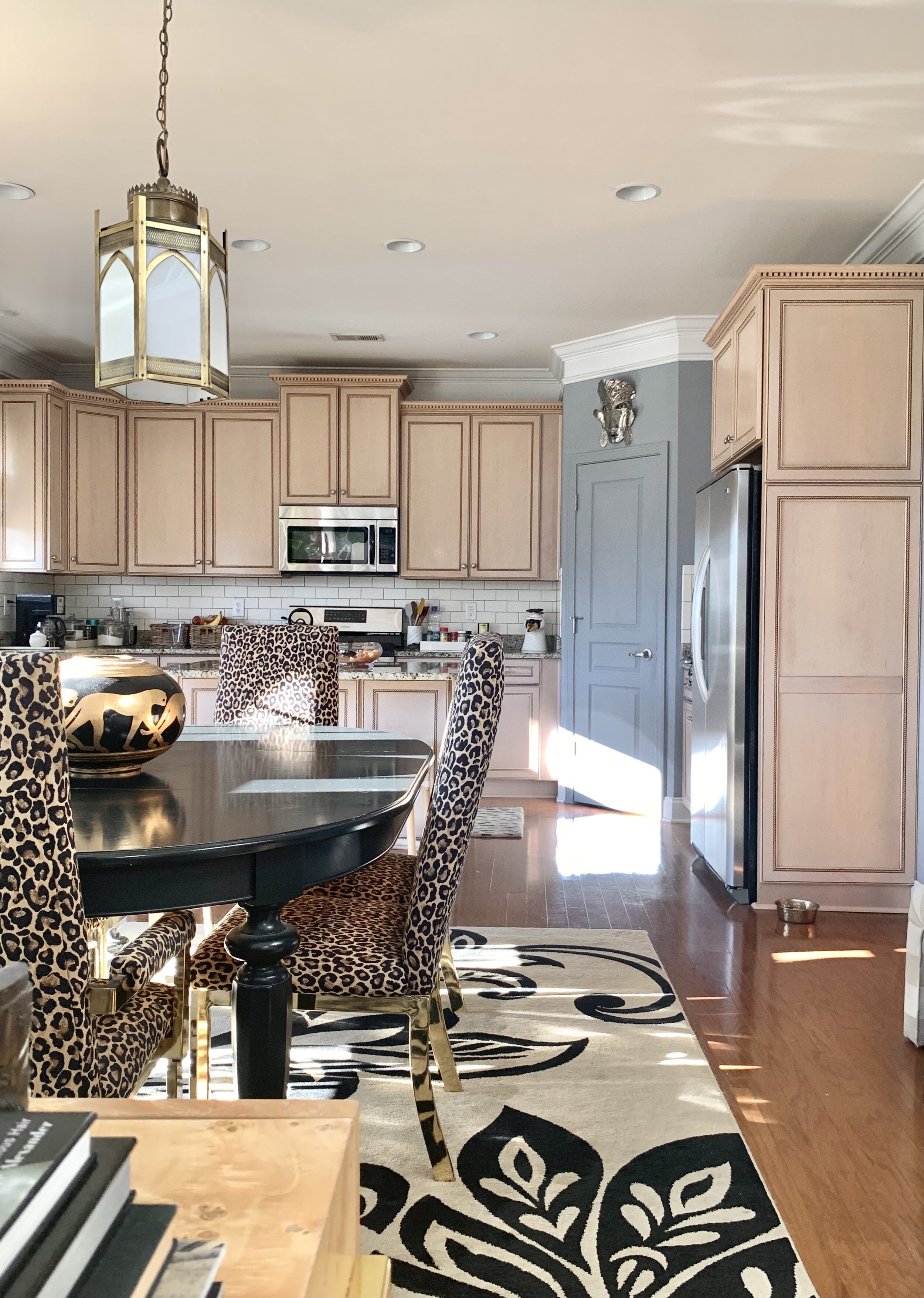
View from kitchen into dining area and what it looks like today. The masks are staying on the wall.
An older view from the garage entry. This pendant was replaced by the current one in the photo above. I had a thing for florals (still do). This light didn’t give off good lighting. It was too dark when we played games.
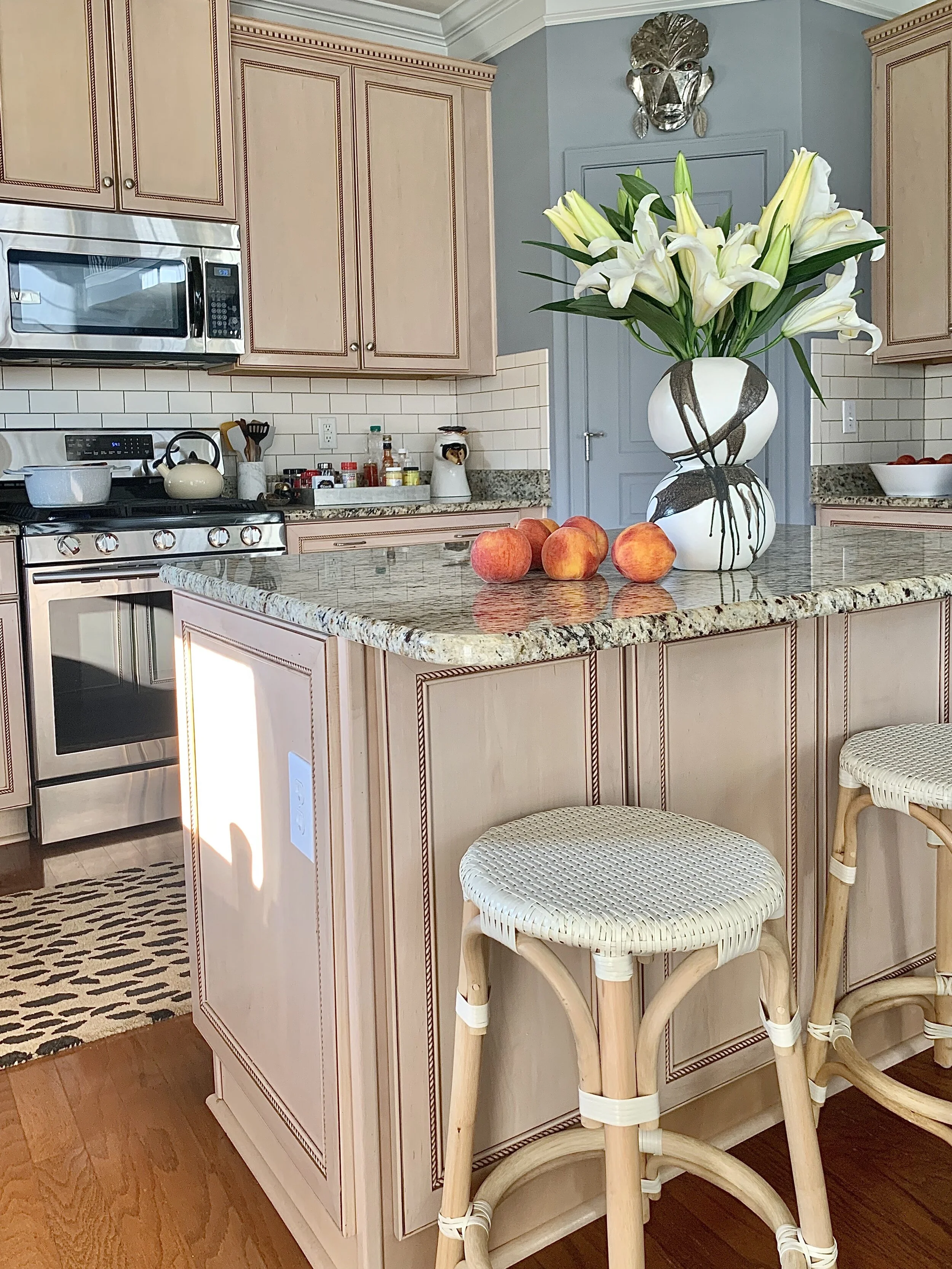
Mask wall is staying.
Stools are being recovered in a Calico Corners fabric.
Here’s a hint, I’m calling my re-design Art Deco Inspired Living. Art Deco has an emphasis on geometrical patterns in symmetrical arrangements, vibrant, contrasting colors and clean strong lines as an organizing design principle. You’ll have to wait to see the design plan but let’s see what the other designers and bloggers are up to, shall we:
At Home With Ashley | Banyan Bridges | Bari J. Ackerman | Brit Arnesen
Brownstone Boys| Cass Makes Home | Dominique Gebru | Gray Space Interiors| Haneen's Haven
Home Ec. | Nile Johnson Design | Pennies for a fortune | Prepford Wife | Rachel Moriarty Interiors
Sachi Lord | Susan Hill Interior Design | This Is Simplicite | Tiffany DeLangie | Victoria Lee Jones

